click to enlarge 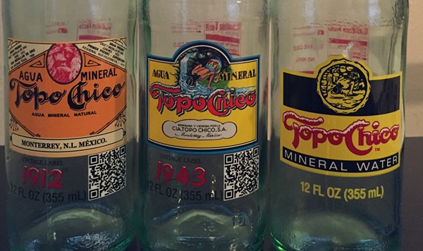
Matt Stieb
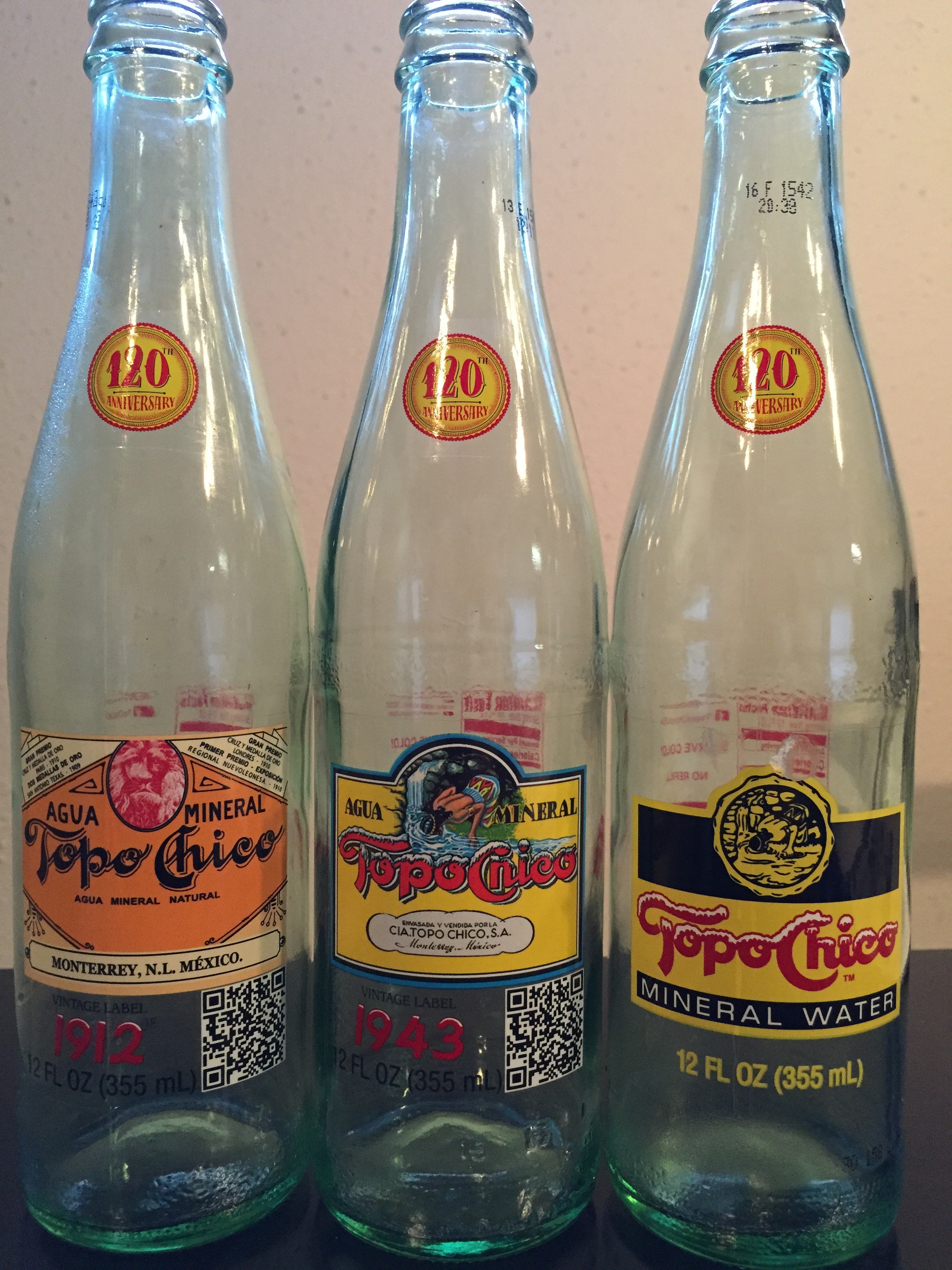
Topo Chico logos from 1912, 1943 and today, respectively
I'll admit it, I'm a Topo boy. A teenage habit of guzzling sodas left me with a strong craving for carbonized bevs, even if the days of six Mountain Dews from the fridge are, thankfully, long gone.
On top of its reputation as the bubbliest of mineral waters, Topo Chico revived a few vintage designs for the company's 120th anniversary.
This bottle, dating back to 1912, features a tawny orange a little darker than the bright yellow on the regular bottle. It also reps Monterrey, the drink's hometown, a slightly harder than the other two, with a big home address stamped on the front.
The red lion is a little sad and weird, but we're willing to discount it for the sweet Belle Epoque-lite feel. Plus, a few years before this 1912 design rolled out, Topo Chico won a gold medal in San Antonio, according to the bottle's résumé on the top corners.
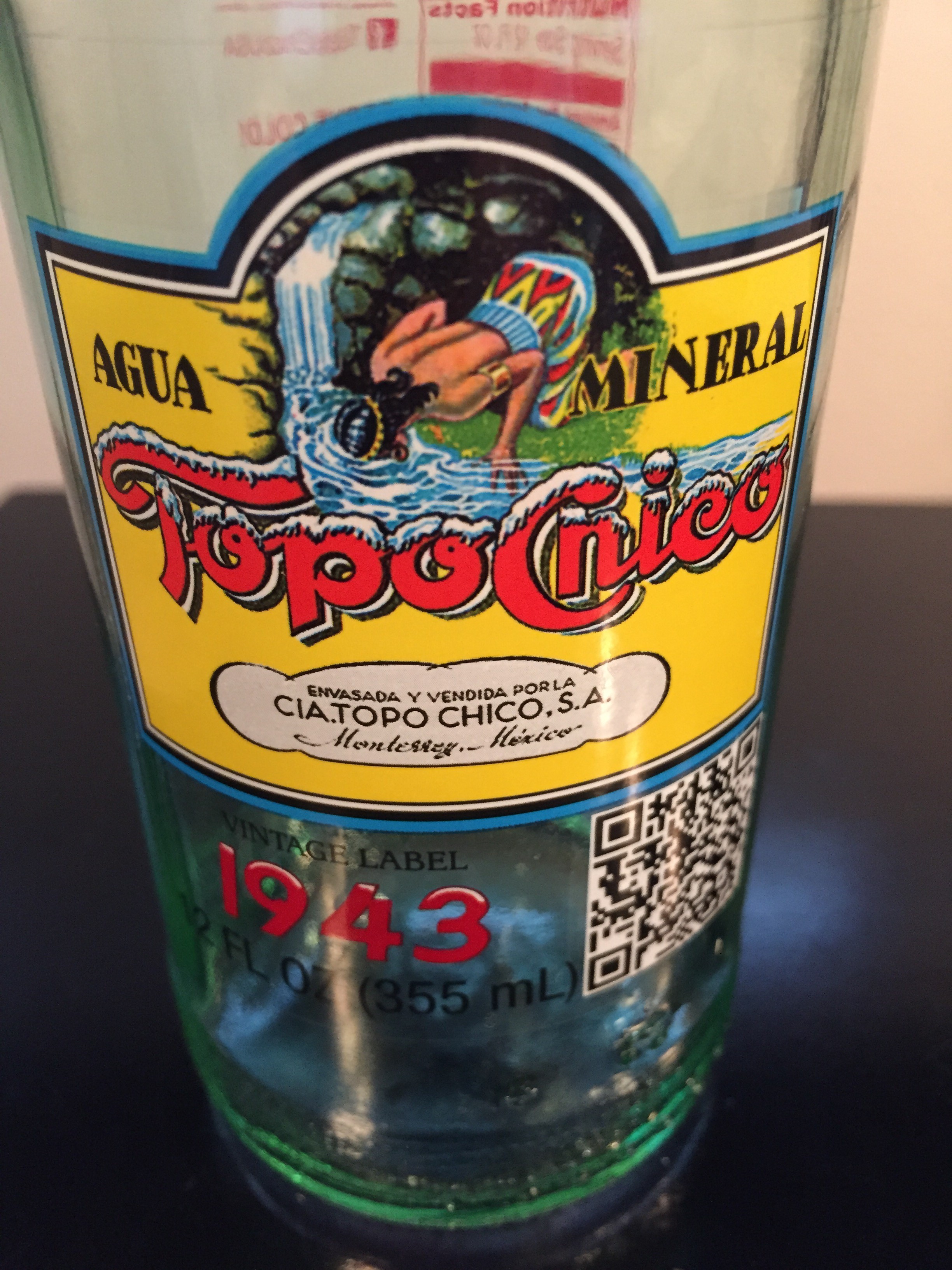
In bright color, the 1943 edition takes on Topo Chico's origin myth — when the bubbly natural spring in the hills of the Cerro de la Silla healed the daughter of Aztecan Emperor Moctezuma I.
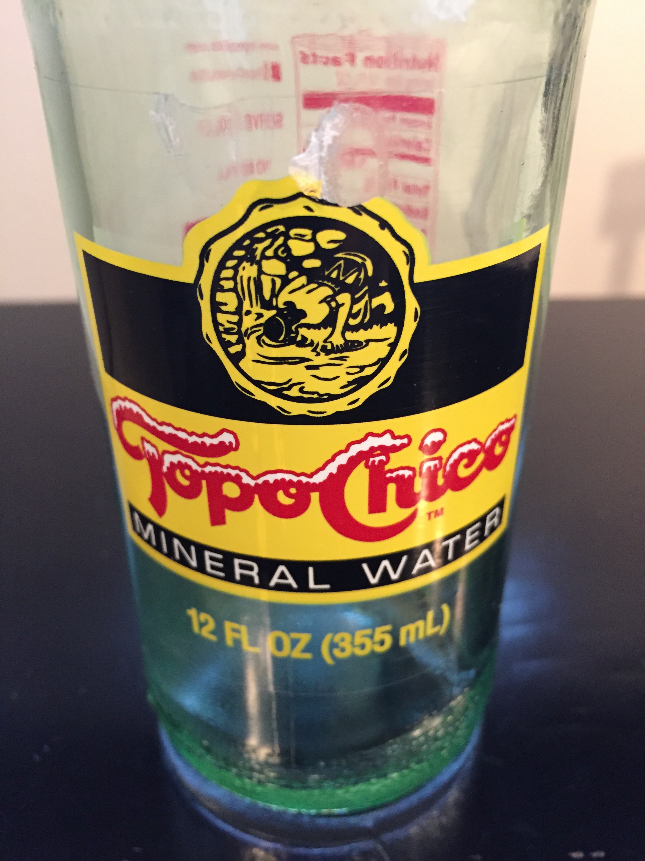
Toned down from the 1943 edition, the current bottle is sweet, simple, classic. But who knows? Topo Chico may pull a
Miller Lite and retain a vintage logo for good. Either way, it's the inside that counts.